Loading...


This page is the content author reference for the Next.js developer portal. It shows the markdown patterns and MDX components that are currently supported in this project.
If a page renders blank after a content update, first check for MDX syntax issues such as a missing closing tag, an invalid JSX attribute, or unescaped curly braces in prose.
PLEASE DO NOT DELETE! This is a reference page for the markdown language
Creating a page
Add file > Create new file
Enter name. Add a / if you want it to be a folder e.g. reporting/ this places the page in a folder
The page name needs to end in .mdx (if you forget to do this you can always jump back in and edit but the page won't work on the front end without .mdx at the end)
Top of page
Always need to have the section for your page starting with --- and finishing with ---. See top of this page in GitHub
Notes:
title is required.subtitle, description, show_md, and pageType are optional.tag is typically rest for developer portal pages.show_md: false hides the Copy as Markdown action.Standard markdown formatting is supported.
Italic or Italic
Bold or Bold
Strikethrough
code font
Use _ to show an underscore literally.
Superscript: 1
Subscript: 1
type is optional — if omitted, it defaults to info (purple). Add type="success" or type="danger" to use a different style.
Orange. This is a danger infoboxGlobal Payments Developer Portal.
<Infobox type="danger">
Orange. This is a danger infobox.
</Infobox>
Purple. This is an informational infobox Global Payments Developer Portal.
<Infobox type="info">
Purple. This is an informational infobox.
</Infobox>
Green. This is a success infobox Global Payments Developer Portal.
<Infobox type="success">
Green. This is a success infobox.
</Infobox>For more details, visit the Global Payments Developer Portal.
<Infobox type="info">
For more details, visit the [Global Payments Developer Portal](https://developer.globalpayments.com/en-US).
</Infobox>Use normal markdown links for internal, external, and anchor links.
Use a standard markdown link pointing to a file path under gh-assets/files/. Files render as a clickable download link. The maximum file size per GitHub upload is 25 MB.
Use the <Button> component for styled call-to-action links. The variant prop controls the visual style and size controls the button size.
Notes:
variant — primary | secondary | outlinesize — sm | md | lghref is required; use a full path or an absolute URL.All images must be stored under content/gh-assets/ in the content repo. Reference them in MDX using the path /gh-assets/filename.png. There are three supported ways to embed an image.
The simplest way. Use this for most images. No custom sizing or alignment.
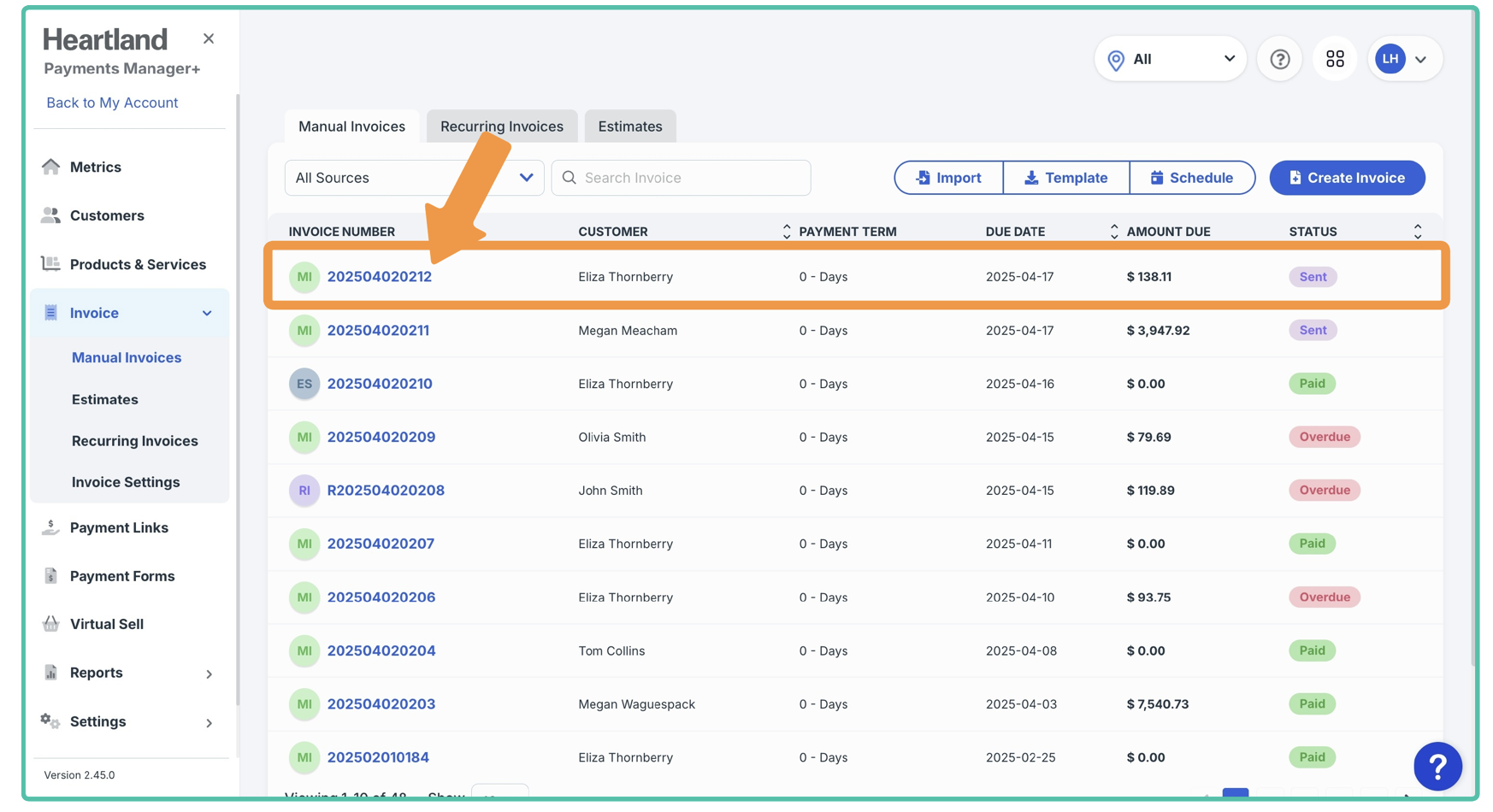
Use an HTML <img> tag when you need to control the width or center the image.
Add a centered caption below any image using an HTML <p> tag.
Image caption goes here
Not supported: Hotlinking external images (e.g. https://... or http://localhost:1234/... URLs) will break in production. Always upload the image to content/gh-assets/ first.
Use the <Flag> component to display a country flag. Pass the two-letter ISO 3166-1 alpha-2 country code to country. The size prop is optional — if omitted, it renders at the default (text-base) size.
Notes:
country is required — use the two-letter country code e.g. us, gb, de, fr.size is optional. Available sizes: xs | sm | (default) | lg | xl | 2xl → 9xl.This is some text with a tooltip. Hover over the tooltip word to see the tooltip content.
Use CardsGroup with Card for a responsive grid of navigation cards.
This card links to an internal page.
This card links to an external page.
This card has no link.
Notes:
title is required on each Card.link is optional — omit it for a card with no navigation.icon is optional — accepts a Font Awesome class string e.g. fa-regular fa-rocket.Use OverviewGroup to create grouped navigation or category layouts.
Short description
Short description
Notes:
OverviewItem requires title. icon and description are optional.OverviewLink requires url and title. description is optional.Use CreditCardGroup and CreditCard to display test cards.
Notes:
type — card brand label e.g. Visa, Mastercard.number — the test card number to display.success — optional, defaults to true. Set success={false} to show a decline/error state.Use <CodeGroup> to wrap one or more <Code> blocks. Each <Code> becomes a tab in the group.
This is a single tab code group
The contextual links (API Explorer / Postman buttons) are per tab — only the buttons for the currently active tab are shown. Switch tabs and the buttons update. If a tab has no contextualLinks, no buttons appear for that tab.
Notes:
contextualLinks is per <Code> tab — each tab can have its own links, different links, or no links at all.apiExplorerUrl — relative or absolute URL to the API Explorer page.Use <Tabs> with <Tab> children to show tabbed content. active on <Tabs> sets the default open tab — use the id of the tab you want open. When linking to a tabbed section from another page, append #tab-id to the URL e.g. URL/#api, URL/#hpp, URL/#hosted.
id is api, title is API
Use a inside a tab to show a code block.
Notes:
active on <Tabs> — set to the id of the tab that should open by default.id on each <Tab> must be unique and lowercase — this is also used as the URL anchor e.g. #api.title on each <Tab> — the visible tab label.<Tab>: markdown, headings, <CodeGroup>, <Infobox>, etc.This is a simple table. Here is what makes it useful:
| Card Number | Card Type | Result | Code | Description | Currency |
|---|---|---|---|---|---|
| 4006097467207025 | DCC | Successful | 00 | Successful transaction | AUD |
| 4002933640008365 | DCC | Successful | 00 | Successful transaction | EUR |
| 4006097467207025 | DCC | Successful | 00 | Successful transaction | AUD |
| 4002933640008365 | DCC | Successful | 00 | Successful transaction | EUR |
| 4006097467207025 | DCC | Successful | 00 | Successful transaction | AUD |
| 4002933640008365 | DCC | Successful | 00 | Successful transaction | EUR |
| 4006097467207025 | DCC | Successful | 00 | Successful transaction | AUD |
| 4002933640008365 | DCC | Successful | 00 | Successful transaction | EUR |
| 4006097467207025 | DCC | Successful | 00 | Successful transaction | AUD |
Here Entries are 10 so show more button will appear
| Amount in Token | Card Type | Result Code | Message | AVS Postcode Result | AVS Address Result |
|---|---|---|---|---|---|
| 10.00 | VISA | 00 | Successful | ||
| 11.01 | VISA | 101 | Declined | ||
| 11.02 | VISA | 102 | Referral B | ||
| 11.03 | VISA | 103 | Referral A | ||
| 12.05 | VISA | 200 | Comms Error | ||
| 20.00 | MC | 00 | Successful | ||
| 21.01 | MC | 101 | Declined | ||
| 21.02 | MC | 102 | Referral B | ||
| 21.03 | MC | 103 | Referral A | ||
| 22.05 | MC | 200 | Comms Error |
| Step | Description | Visual |
|---|---|---|
| 1. Browse Equipment | Customer browses available equipment options to buy. | 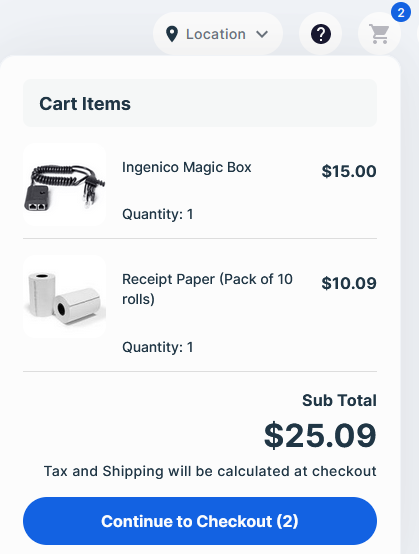 |
Order Transaction Process Example
| Term | Definition |
|---|---|
| Account Name | Standardized name of a capability type (i.e., one of our payment-processing solutions) that allows certain data to be accessed through an API request. When you want to use a capability in an API call, you need to include its name in the API request’s account_name field. Examples include: transaction_processing, dispute_management, risk_assessment, settlement_reporting, etc. |
| App | Set of credentials that you need to execute API actions on our server. Each app consists of an App ID and App Key, which together serve as a bearer token to access our endpoints. An app also includes customized capabilities, which in turn determine what API actions are allowed when sending requests. For more information, see the Apps and testing environments section. |
| App Name | Machine-readable version of the display name you give your app when you first create it (i.e., underscores replace blank spaces). It’s created automatically and can be edited before the app is first saved but not after. Allowed characters: [a-z_0-9]. |
Use the <Plugins /> component to render the plugins search and card grid.
No Code
Select from a variety of plugins and integrations for an easy, no code developer experience. They cover most of the major shopping cart platforms and are always up to date with the latest releases and features, including Card Processing, Hosted Fields, Order Management, Card Storage, and Alternative Payment Methods.
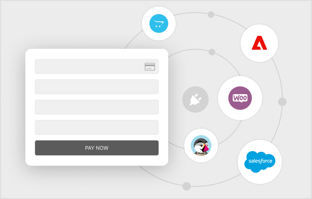
Discover the many benefits of integrating with our API. Just to name a few:
A single integration opens a world of possibilities. Not only does our API allow you to take and manage payments online or in-store, but we offer many other features and capabilities that add value to both your business and your customer experience.
Online or in-store, a simple integration connects you to our vast payments ecosystem.
Securely store customer and card data for single or multiple transactions while also managing monthly subscriptions.
Offer cardholders traveling internationally the choice of paying either in the currency of their own card or the currency.
Add alternative and local payment methods to your offering, including PayPal, GooglePay, ApplePay and many more.
Add 3D Secure as well as Fraud Filters with Decision Management to better identify your customers and reduce fraud.
Reconcile transactions and manage your daily fund transfer processes with both Real-Time Data and Settlement Reporting.
Our solutions are available in the following regions. For more specific information, check with your account manager.
United States
Canada
United Kingdom
Europe
Our API covers multiple capabilities, so let's get to it and start taking payments. Get up to speed quickly using the steps in our guides for online and in-store payments.
Use the supportedLanguages array in config.json to override default regions and languages available in the regional selector. Each entry defines a locale code, display name, country flag, and optional currency.
config.json file at the root of your environment configuration.config.json file at the root of your environment configuration.config.json file at the root of your environment configuration.supportedLanguages array.code, name, and flag fields.currency for the region, or leave it as an empty string to inherit the default.